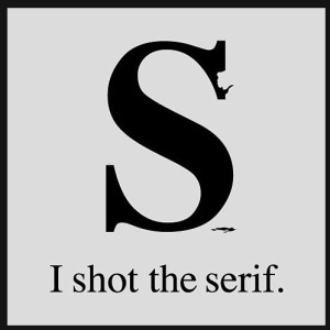
This article was very interesting but still, when it comes to choosing serif or san serif I think it is most challenging when involved in design or call to action.
As far as reading in a book I still agree the body text reads best when serif’ed and reading online I’m partial to san serifed font because it doesn’t look so blocky or heavy. It all comes down to using your best judgment, hope you enjoy the article by Alex Poole.

Leave a comment